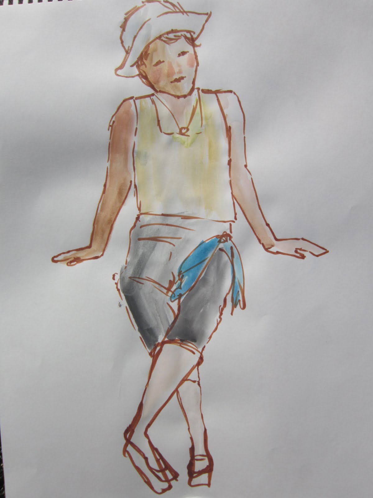
Tuesday, January 10, 2012
Another Experiment
Wednesday, September 21, 2011
Live clothed model session


Sunday, December 5, 2010
Portrait in Acrylics
This is a first for me - a portrait done in opaque acrylics, and truly I had quite a learning experience. Unfortunately, I can't get the colors true in this reproduction. I have not yet bought any Ampersand panels as suggested by Hallie, so I gessoed over a failed watercolor painting on Arches 300 pound paper. The support is quite rough and very rigid. I drew the figure on tracing paper to avoid erasures on my support. I transferred the drawing using a method I learned from Myrna Wacknov. I turned the tracing paper over and went over all my pencil lines with a blue watercolor crayon. Then I placed the tracing paper over my gessoed paper crayon side down and used a ballpoint pen to trace over the lines. A very thin line of watercolor crayon gets transferred to the support. The line disappears when painted over as it dissolves with water, more critical when using watercolors, but a great method.
I wanted the acrylics to remain open and blendable for a while, so as recommended in Barclay Sheaks classic book, I used an acrylic gloss medium over the surface and to mix, slightly diluted, with the paints as I applied them. At first I was like a young child trying something new. Then things began to come together for me as I found how much paint I needed to apply and how to blend the edges. I like the way I managed to keep the edge of Jamie's hair soft and to blend her left shoulder with the background. I am inspired to try more people paintings. The gesso over rough thick watercolor paper provides an interesting subtle surface that glows from the glossy gel medium.
The source was a photo of granddaughter Jamie at the beach in Capitola during their July visit. Like everyone who visits California, Jamie expected very warm days. This summer was about the coolest on record in recent years, but even in the warmest summers, the coast and San Francisco can experience fog and cold. Mark Twain once wrote "The coldest winter I ever spent was a summer in San Francisco." He was surely exaggerating as Vermont winters trump it every time. But you get the picture. So Jamie wore her sundress. She was able to shed layers briefly and enjoy the warm coastal sun about 2 p.m.
Using Photoshop, I isolated the portion of the snapshot I wanted to use and enlarged it a bit so I could see Jamie's features. For the background, I took inspiration from the colors of the beautiful beach houses reflected in the water where the San Lorenzo River meets the sea. Here is the source photo.
I had a lovely time with my latest adventure in art. I need lots more practice on how to apply thicker paint and paint skin.
Friday, February 12, 2010
In the sketchbook
We are missing touring with our bicycles. Next year we plan to ride our touring tandem from Florida to Maine, but this year, no big tours await. So we decided on the months when we are not taking a trip, we will do small tours. Amtrak California has many places you can go with your bicycles. We are fortunate to own folding tour biycles that can be put in a common luggage rack if there is no bike car. Amtrak buses will carry bicycles in the luggage compartment.
Adventure 1: Take the Capitol Corridor train to Sacramento, about a 2.5 hour drive by car, visit the world class train museum in Old Town, stay in the couples suite at the Internation Youth Hostel, ride to Davis the next day, and catch the train back to San Jose. This trip also involves riding a few miles to Light Rail, going downtown, and riding a mile to the train station to cover the 14 miles from home in a timely fashion.
One thing we learned touring is "be flexible because things will happen." At the station, we learned that the tracks were under repair between Fairfield and Sacramento for several weeks, so we had to be bused in that area. Amtrak told us we were taking a chance they could not carry our bicycles. We were prepared to ride 45 miles if necessary, but it would have messed up our museum visit. All went well both ways and we had a wonderful trip.
I took my 4" x 6" Koi pan paint set with Japanese brush that holds water in the handle and a small sketchbook. I captured Bob on the train (this one is for Myrna Wacknov who told Bob she recognizes him from my various sketches and painting), a pen and ink sketch of a man reading a book while waiting outside the Davis Amtrak station, and a watercolor of the same man. Waiting areas are great places to capture people who tend to stay put. The paintings were done without drawing them on the sketchbook.
See finished pieces of Adult Bob and Baby Bob posted earlier in this blog.
Friday, February 5, 2010
At Bernal Bagels and Donuts
14 x 21"
When I took Myrna Wacknov's portrait workshop, Myrna had us paint a side profile of a young person with smooth skin. I asked the young woman if I could take her picture and explained why. She was gracious and turned sideways to accommodate me. I ended up doing a different painting that day, but the young woman asked me about my progress and wanted to see the painting when complete. I figured I owed it to her to do this piece now. First I reversed the direction of the photo in Photoshop. Somehow I had a better feeling of her gazing right. On Thursday night at my art group I drew the piece on tracing paper , applied watercolor crayon to the lines on the reverse side, and traced over my drawing transferring the watercolor line to Arches watercolor paper as Myrna had taught us. I achieved a reasonable likeness. I selected the watercolor paper rather than Tyvek because the woman has such smooth skin.
This afternoon I got out the paints and completed the work. I really want to try a more experimental background, but first I must show the painting to the young woman in case it goes south on me. Of course, with my tracing paper ready to go, I can always do a second painting, the beauty of Myrna's process.
Tuesday, January 19, 2010
Myrna's Workshop, Installment 2
14" x 19"
Watercolor on Tyvek
14" x 16"
Watercolor on paper
We completed our 5-day workshop today. I believe I made some progress. Of course, drawing is all about seeing, and in the case of portraits, about knowing structure so you can apply what you know.
"Quiet Beauty" was my profile portrait. Myrna pointed out ways to check relationships, and also talked about eye structure. I always wonder how many times I have to be told these things before they become a part of what I know. I chose to do this piece on Tyvek. We had critique at 3:00 and it was fun to see the results of our work. I was pleased when Myrna said she thought this was the best drawing she had seen me do, and over the past couple of years, she's seen quite a few. Myrna created a slide show of profile paintings.
Today, Myrna's morning demo focused on painting small children. They are born with adult-sized eyes, but the rest of the facial structure is infantile, so feature placement is different. There is more forehead above the eyes. She also pointed out that light, transparent colors say child. Children are very rosy, so she used lots of rose on her painting. When doing the eyes, do not close the bottom lid with a line. She works quite wet on watercolor paper to achieve softness. I chose to paint Bob as a baby. The photo is part of a collage of family photos that include Bob and his two daughters, when each were 18 months old.
Myrna said I had done a great job on the drawing. She suggested a better approach to adding the shadow colors on the lower face. She glazes single colors in layers rather than mixing the shadow color on the palette. I want to paint this piece again, but I want to create a full sheet with Bob and his two girls from the family photos. I am always struck by the distinctive shape of their mouths and full cheeks. I will work on a design. You can compare baby Bob to grown up Bob here , done in profile.
Monday, January 18, 2010
Myrna Wacknov Workshop
Myrna Wacknov is teaching her Beginning Portraits class for the Santa Clara Valley Watercolor Society. If you like to do people and you enjoy Myrna's experimental approach to watercolor, take this class if you have the opportunity. Being raised in New England, there is a touch of the Puritanical upbringing that says it's sinful to have this much fun!
If you follow Myrna's blog, you will recognize Linda as one of Myrna's images. I painted Linda because Myrna likes my image of the Egg Lady, an old woman we saw in France. Most juried shows do not allow a piece of work done in a workshop under supervision, and Myrna did not want me to waste my image in class. She told me to practice the techniques and then do the Egg Lady. Thus I painted this image with Myrna's permission.
Myrna began the class by stating this workshop is more about drawing and less about painting, though we got to paint quite a bit. The first day was spent creatively learning about the proportions of a human face and how to design our painting. As Myrna pointed out, the photo is the reference, but you do not just reproduce the painting. You must apply design principles. She had us do 3 thumbnail sketches with different value patterns. She really liked my pattern that used rim light. Myrna saves pictures from magazines and newspapers that have interesting value patterns, so she pulled out a photo that used rim lighting and pointed out that the features were all visible, but the background was dark and the person was lit with a halo effect.
Next we cut our paper to size, ensuring it was proportionally larger by using a method Myrna demonstrated, that I had learned in Arne Westerman's workshop several years ago. Next we cut tracing paper to size, allowing for the space a mat would cover, and drew our image on the tracing paper using a simplified grid method. Basically we folded the paper lengthwise and crosswise so we had the midpoints in each direction. This makes it easier to achieve placement and correct proportions. Then Myrna showed us her method of transfer which she believes she invented. We turned the tracing paper over and traced over the lines with a turquoise blue watercolor crayon. We turned our tracing paper back to the drawing side, taped it over our support, and used a mechanical pencil to transfer the lines. Myrna does not like using carbon paper for this application because it can leave residue on the support. Watercolor crayon dissolves as you paint, and the blue is nice if any of it remains.
Myrna likes to paint on different surfaces. My first painting is done on watercolor paper that I gessoed. You can even cover over failed paintings and reuse your paper. (Just think how excited future art critics will be when they discover a second image underneath your Mona Lisa). I had not used this surface before and I really enjoyed the way you can apply paint and lift paint, and the wonderful painterly surface you can achieve. This is a wonderful tactile experience, and I had the feeling of sculpting my painting.
Myrna also paints on Tyvek. I'm not sure how she got started with this paper. It's the same stuff they wrap new homes in minus the writing. Art stores used to carry it, but no longer in our area. It's used by printers. Thus Myrna buys a bundle of 500 sheets at a time and freely sells them to others at $2 a sheet. However, a friend found a place where you can get 25 sheets. More one that tomorrow. The Tyvek has a very plastic surface and there are wonderful threads running all through it, so the resulting painting has great texture. Last year I bought some Tyvek from Myrna and have painted a few pieces on it, but I have little experience. This time I chose a standard lighting pattern, with a single light source from the left. I used a limited palette of Hansa Yellow, Ultramarine Blue, Magenta and Diozanine Purple. Myrna says using limited palette guarantees harmony. Myrna prefers to use Dr. Martin's Hydrus fluid watercolors, but I mostly had to use standard watercolor. She advised that tube watercolors must be fresh squeezed.
By now, it was mid-afternoon and I had a half hour before critique. Myrna had shown us that it's good to learn to use a brush and draw your piece directly on the support. I had also talked with Myrna about having trouble using non-traditional colors. She suggested painting with just three colors that are not flesh tones. When Myrna had talked about thumbnails, she showed us how she uses two L-shaped pieces of mat board and moves it around on the image to determine cropping. She then demoed using one of her favorites, her Morris image. The piece was close cropped and lost one part of the face.
With a half hour left, I grabbed a narrow sheet of Tyvek, selected 3 colors (Ultramarine Blue, Magenta, and New Gamboge) and did a brush painting using Cerulean Blue. Much of the line remains visible. You will see I straightened out the image and it's not quite as accurately Linda, but I had so much fun with this quick piece. Myrna gave me kudos for my bravery.
At critique we saw some wonderful paintings, some by artists who had never painted a person before this workshop. Outstanding! View the slide show on Myrna's blog. Myrna's personal favorite of my images is my first piece on gessoed paper. She said I achieved the best likeness and she loved the value pattern.
I have two more days of workshop -- one day of painting a young adult in profile and the final day is doing a young child. If you are in the area and want to take this workshop, there is a second scheduled for January 22 to 26 and a few slots remain. You can either take the first three days or all 5 days at a cost of $70 per day, a real bargain made possible by the watercolor society staffing with volunteers and taking a non-profit approach. I am the coordinator for this workshop.
Tuesday, January 12, 2010
Experimenting with watercolor on Tyvek
Inspired by Myrna Wacknov's demo and knowing that I will be starting her workshop Friday, I dug out the Tyvek I bought from Myrna last year. I selected a photo of Bob's late Uncle George, a brilliant man who had engineering and law degrees and was the patent attorney for the Eniac, the first commercial computer. This photo was taken when George was in his nineties, sitting in a wheelchair at his son's wedding. It was very hot under the Utah sun, and someone had given him a baseball hat to wear with his handsome suit.
The Tyvek is great fun to work on, but I have very minimum experience using it. I find I like it as a support for people because it resists paint and has a wonderful texture because of the fibers running through it. Tyvek is the product used to wrap houses during construction. I was able to keep working and wiping off and redoing, adding and subtracting, until I declared victory. I especially like the texture and the suggestion of shapes in the background.
Young woman in France

Monpazier, France
Elegant Writer Pen and brush loaded with water
10 minutes
I've been under the weather and trying to get healthy for the class on Friday. No sketching yesterday, but I did this one this morning.
Sunday, January 10, 2010
Heavenly Sketches and a Dynamic Demo

Pastor Warner
Ballpoint pen on church bulletin
1-10-2010
This Sunday was a delightful demo day for the Santa Clara Valley Watercolor Society. I am the coordinator for Myrna Wacknov's workshop that begins Friday, so she gave her demo today. We don't charge for this service, though of course we pay the artist. Many people attended and were spellbound by Myrna's portrait process on Tyvek. Myrna has posted the demo piece on her blog. Unfortunately, with all the things I had to think about for the demo today, I forgot my camera. Many folks were taking pictures, though, and Myrna has asked for some to make a slideshow of the demo. A bonus for all of us is having such a well-known artist as a member of our society, and she had fun doing a demo among many friends.
I leave you with a promise that one of these days you will see a finished painting, because one of my goals is to do at least two every month.
Saturday, January 9, 2010
A Big Art Weekend
The Santa Clara Valley Watercolor Society held it's New Year's Party, the second I've attended. Bob joined me and he was such a help in the setup. We had a fabulous time mingling over appetizers, viewing plein air paintings and sketchbooks, enjoying a marvelous potluck, doing a painting exchange, and winning prizes in support of an art project for children. I was on the decorating committee and worked with fellow artist, Wendy, to put together centerpieces for the Asian New Year Themed party. It was the year of the tiger -- many paper lanterns, chinese takeout boxes, gold coins, chopsticks, fortune cookies, two stuffed tigers, and a wonderful handmade dragon went into celebrating the the Year of the Tiger. I enjoyed seeing many of my art friends, including Mike Bailey and his beautiful wife, and artists who went to France on Mike's 2007 Dordogne trip.
Please forgive the quality of these pictures -- I have my new camera out being repaired at the moment. I displayed several of my plein air paintings from our lovely outings throughout 2009 along with many by other artists. Those are artists's sketch books in the foreground. I participated in the progressive painting. There were two done and this one has some of my strokes buried among the layers. We all added watercolor to the gessoed boards. Then two very accomplished artists, Karen Wong, and Jane Ferguson, pulled them together. They did a fabulous job of turning these paintings into lovely works of art. The one above was completed by Jane. Two lucky winners took the progressive paintings home all matted and framed. I was very happy to receive a wonderful watercolor by our SCVWS Webmaster, Marion Podolski in the art exchange. One of the highlights of our raffle were three paintings donated by two nationally known artists, Jane Hofstedter and Myrna Wacknov. I sure was hoping to win one, but I was not that lucky.
Tomorrow I will be coordinating Myrna's demo for SCVWS. If you are in the area, these demos are free and held at Hoover Historic Theater in San Jose from 1:30 to 4:00. I am so excited about the upcoming workshop with Myrna. No doubt you will get to see some of what I do starting Friday.
Finally, I had to do my daily sketch, so I grabbed a photo of Bob's daughter, Jamie, from her wedding in April. She was crouched over her tiny grandmother on the dance floor. Grandma is a in her late 80s and just loves to dance. I almost captured the expression of fun on Jamie's face. I see the proportions of the body are off a bit -- oh well, that's how we improve our drawing.
Friday, January 8, 2010
2010 Art Goals and a couple sketches
I reviewed last year's goals, and found I met all of them with the exception of sketching daily. I probably sketched 3 or 4 times a week. So this year's goals are set: 1) Sketch daily; 2) Create two finished pieces of art per month; 3) Join a critique group; and 4) Participate in 3 art shows.
Actually, I've already failed to meet goal #1, but it's a worthy goal and I intend to keep plugging away at it. Here are two of my daily sketches. I don't have a good way of capturing my image so I used a photograph from Bob's daughter Jamie's wedding in April. The likeness is reasonable. I fight the desire to make myself less wrinkled than I am! I love the honesty of Myrna Wacknov's self-portraits that portray an attractive, mature, intelligent artist. (Please excuse the date error - it was done today, 2010.) I sketched Bob as he sat in his favorite chair. I hope to improve on capturing his likeness as I continue to use him as one of my favorite life subjects.
At first I was doing the sketches on an old Yellow Pages, but I decided that using a new sketch book would be more pleasing. I'm going to use some different implements and different design techniques to do the sketches. Tomorrow will be vine charcoal.
Wednesday, November 4, 2009
Private Acrylic Lesson
Acrylic on paper
We sat out on her beautiful deck in the hills overlooking the Bay and painted for thee hours. We had a great time. Joyce planned an exercise using a pear because of the simple shapes. I was to learn how to apply opaque acrylic paint similar to doing an oil painting. Joyce would emphasize placing lights next to darks and texturing the surface. We started with 2 full sheets of Arches watercolor paper, one coated with a layer of orange acrylic, and the other coated with a layer of Aso yellow acrylic. We cut the sheets into pieces measuring 5" x 7 ." We then taped three of the pieces together with a quarter-inch separation. The acrylic mother color sealed the watercolor paper so the paint moves lusciously upon the surface and is easy to manipulate.
Joyce matted two of the finished pieces and placed them in plastic protectors. The top piece above was my first effort, and really my favorite of the six I completed. As I painted with Joyce, I learned to achieve different effects. I used a palette knife to manipulate paint in the upper left corner, a piece of ridged cardboard for the table top texture, and scraped down to the orange in the highlight area of the pear with a piece of Starbucks gift card.
The second piece also employs my new favorite mother color, orange. I used crumbled plastic wrap to achieve the textured background, and stamped into the wet paint on the bottom with waffled rubber. I also scraped out some of the highlights on the pear with a palette knife. This manipulation exposed some of the mother color.
The third piece was also done on orange. Here I used lots of texture, layering paint and scraping with a palette knife. Joyce suggested adding a highlight with some contrasting paint. I selected hot pink and placed some on the left of the pear and on the stem and leaf. I tried playing around with some white paint and some purple to add lights and darks.
The fourth pear was created on the yellow mother color and I found it more difficult to select my colors for pleasing results; however, I am satisfied with all three pieces. Joyce had to do a touch of scraping in the pear highlight and add bit of paint for asymmetrical leaves to add some excitement. Then she suggested I drizzle some "tar gel" on the surface for some very interesting results. The gel makes loopy, organic lines that dry clear to reflect light at interesting angles and please the eye.
After matting and bagging the two pieces, Joyce loaned me a Stephen Quiller CD for the week, gave me leftover paints, showed me how she and Myrna Wacknov make a little travel kit of watercolors using an Altoids box and bottle caps and the resulting original gift cards she created while sitting for two hours in a plane on the tarmac. Joyce and I finished the day at a sweet Mexican cafe with delicious prawn tacos. I had a lovely time and look forward to our final session next Wednesday.
Wednesday, September 23, 2009
Upcoming Workshops and Inspiring Artists
Sunday, August 23, 2009
Brommer Workshop Recap

Beginning phase of a montage of my bicycle ride across the USA
Collage and watercolor
The week was so busy that I did not even have time to post the final three days of the workshop. We had a wonderful time. I felt like a kid again with my matte medium, gesso, pens, rice paper, and paints. I also was humbled by the beautiful work turned out by my colleagues in the workshop. Jerry said this one of the two most accomplished groups of artists that he had had in his workshops over the years. Privately he told me that several were way beyond needing a workshop, but of course creative people love to learn new ways of working and thinking. Take this link (Myrna's name) to see the work done by Myrna Wacknov during the workshop, so good that Jerry needed a piece for his collection. Myrna teaches many workshops nationwide, is an award-winning artist, and has been featured in popular art magazines.
Jerry at 82 is just as excited about art as he was as a child. He keeps learning new things (for example, that gesso can be applied successfully to a wet collage) and pushes his experimentation. He is humble and inspirational. He kept giving us pearls of wisdom, and I enjoyed his stories of many of the famous artists we admire who have been his friends. He also gave me his full-sheet demo painting that I will treasure, though Jerry did not have time to complete the detail and darks over his underpainting.
The pieces I show here were done on days 3, 4 and 5. To be successful, I would need to redo them. I've said before that my engineering mind is very literal and it takes me a while to apply what I learn in a creative way. I will explore this medium in the coming months as I really love the textured surfaces and the effects we achieved. Each piece was supposed to maintain separation between shape and line. The piece on Day 3 is from a snapshot I took in the Dordogne, while on a Mike Bailey art vacation in 2007. We built up the surface by applying rice papers with pieces of brown paper bag for the dark values. We drew into the wet collage and added paint. Applying white gouache does some really interesting things to the surface.
Day 4 I completed the bridge in Ronda, Spain, that I visited in 1989. Ronda is one of the "white towns" in Andalusia. This bridge is the newest of the three bridges that have spanned the gorge. The first was built by the Romans, the second by the Arabs, and third is the "new" bridge built by the occupants of the town in the 1700's. New is relative. As we stood on the bridge, we could see remnants of the two older bridges hundreds of feet below us. I struggled with this painting and in the final 15 minutes before critique, I got a suggestion from Jerry to apply gesso over parts I did not like and rework them. I worked furiously and Jerry was amazed that I pulled the iron out of the fire in those few minutes.
Day 5 is just the beginning stages of a complex exploration of a theme, in my case my bicycle ride across the USA in 2008. The top 1/3 of the page is picture that embodies the theme, and the bottom 2/3rds will be filled with small line drawings with color and images of items related to the theme. I selected an image from the middle of the country, where we were treated like royalty, tiny Woodbine, Iowa. The L stands for Lincoln Highway, the first highway to be completed across the USA. The old service station had been turned into an internet cafe by the junior high science teacher and his wife. They love to take pictures of people touring the country in front of the mileage to two major East and West Coast cities.
We were instructed to collage the entire surface, let it dry, add a thin layer of diluted gesso, let it dry, and then work on that surface. As we worked, we could add more collage, more gesso, paint, photographs, pieces of related paper, whatever. Eventually, I would add a border of darker color around the edge to organize the collection. At critique, I was especially fond of a piece done by Jean D. who collaged using various old documents (or copies of them) and then had a male figure walking into the documents. A serendipitous smearing of the ink on the figure created the most wonderful results. To me it certainly suggested the past.
Jerry's approach, with any piece, is to do some planning, but he never knows exactly how the piece will turn out, very reassuring to me. He lets what's happening on the surface inform subsequent steps in the process.
The workshop went well administratively, my first time to coordinate one for the Santa Clara Valley Watercolor Society. Bob and I especially enjoyed getting to know Jerry and his wife, Georgia, first at home, then at two subsequent dinners, and a final drive to the airport. They are such wonderful people. Jerry says that we are changed with each experience we have in workshops. I can't wait to take that change to a new level.
I have a few more obligations and then in the next few days I will be checking out what I've missed from my fellow bloggers.
Monday, August 17, 2009
Gerald Brommer Workshop - Day 1
The workshop I am coordinating is "From Line and Shape to Complex Surfaces." Today Gerald Brommer explained that we should treat the two elements of design, line and shape, as independent of each other. We should not be outlining the shape, nor should we be filling in the shape we've created. Both would look like a coloring book. Instead, we either put down shapes in light to mid-tone values and then draw our image over the shapes, or we draw our image and add shapes. We finish with some overpainting, but again avoid filling in the lines with color. We were told not to erase anything. We could draw in pencil and then in ink, not following the pencil line exactly. We drew on quarter sheets from our own reference materials.
We selected one piece for critique (I actually did 3 quarter sheets and started a fourth). I choose Cinque Terre wildflowers, done from a photo taken when pal, Joan, and I went to Italy for a watercolor workshop in Western Tuscany. First we spent a few days in a tiny town just south of the Cinque Terre, where we relaxed, hiked, and sketched. Gerri liked the piece and made two suggestions for improvement, which I haven't done yet -- balance the right corner with a small shape of strong color on the lower left, and add more line to the two plants that reach above the sea on the left. He was enthusiastic about my cypresses, though I didn't put it up for critique. Gerri is such a wonderful instructor, and loved by many. We have a fabulous group of people taking the class, including Myrna Wacknov, so it's really neat to see the art they produce. It's also like old home week for my France trip in 2007 with Mike Bailey -- Myrna, Carrie, and Lisa are all in the workshop! We ended the day tearing pieces of rice paper, staining them with various shades of a couple colors, and allowing them to dry overnight. Tomorrow we begin the collage process.
Yesterday's demo went well, the first I've coordinated. The room was full, probably 75 to 100 observers. Gerri said he couldn't demonstrate collage on the spot and what we would do in class were small pieces. So I brought him a full sheet of Arches 140 lb. paper and a support so he could demo his design and painting process. Like all masters, he made it look so easy, and the crowd loved it. Gerri gives you permission to do anything in art -- no, a watercolor must not all be transparent; yes, you can use opaque white and colors; you can move things around; you can eliminate what you don't want and add something you do. You can do many variations from one simple sketch or photo.
I am learning the mechanics of being a coordinator, quite a bit of work as we provide a nice series of snack morning and afternoon during the workshop and for the demo on Sunday afternoon. So far, I've been to Costco twice, and the farm stand once. Then there are the various vagaries of the locks for kitchen, water supply, classroom, restrooms, and atrium. All is going smoothly and I am having fun. I have a terrific assistant, Irene, who has jumped right in on setup, cleanup, and ordering and picking up the instructors lunch.
Wednesday, August 12, 2009
Creating prototypes
I am working towards a piece for "Linear Perspectives," the Santa Clara Valley Watercolor Society show in October. I must complete it before the end of the month if I intend to show this piece. (I have a backup plan, not to worry). So last night I painted a quarter sheet. I decided to invent a background that suggests mountains in a dry land, but very linear in keeping with the theme of the show. I know I want to show the beauty of the gowns, so they will be brightly colored and detailed, but the overall plane is flattened. I'm not great at Photoshop (I'd rather paint), so I printed out the three brides in a size that would work for an 8 x 10 prototype, and I cut out the three brides. By now I was recalling the paper dolls I so loved as a child.
I took two failed paintings and cut them into several smaller pieces. I drew the background on the back of each piece and experimented with color, tints, tones, shades, and value patterns. This process took little time and I could then put my three ladies on the background to check results. At one point, I looked at the blog of Peggy Stermer-Cox, one of my favorite artists. Peggy does non-representational work and has some knockout series on her blog. She spends lots of time experimenting with value patterns, design, and color. I checked out Kitty, Kitty, because I love her use of blue and orange, which is very soft. (Do check out her work -- her name is an active link .) I'm also being influenced by Myrna Wacknov's recent experiments with color on her blog.
I knew I would be using Cad Red for the bridal dresses, so I took some license with the color combination. The second picture shows my use of Cad Red Light and Windsor Blue (green shade) for the mountains and foreground. I loved how they neutralized each other. I did introduce one other color, Raw Sienna, into the sky, and dropped in the red. I decided that I am quite taken with the neutralized background. My next step is to do a half-sheet painting.
Sunday, August 2, 2009
Santa Clara Valley Watercolor Society "Anything Goes" at the Palo Alto Art League

11" x 14"
Watercolor and charcoal
Here is the beautiful flyer featuring art by several of our many accomplished artist. If you live in the area, the show is on through the end of the month. The reception is Friday night and this is my very first art reception for a public show sponsored by others. I am looking forward to a lovely evening. Please feel free to drop by between 6 and 9 p.m. Wine, light refreshments, and terrific art will make the event special, and you might choose a piece to add to your collection. Bob and I hope to see you there.
We could enter one framed piece and two matted, unframed pieces. I framed "Morning Light" previously featured on this blog. I did a bit more tweaking since I posted the piece, but I can't show you the improvements as I failed to photograph the finished piece. The unframed pieces include "Dordogne Sunflower" previously featured on the blog. "Dancing the Blues" shown above is the second piece. This is an image I have done in series as a part of a challenge on Myrna Wacknov's blog. I especially like the use of charcoal line on this one and the energetic background. Myrna has a lovely acrylic on display at the show.
SCVWS is a well-oiled machine and everyone who enters the show volunteers for a task. When I arrived at 11, the place was buzzing with volunteers examining the framed pieces to ensure compliance with show rules, receiving the art, and creating labels for the framed art. I was part of the hanging committee, with experienced hanger Karen Wong providing guidance to several of us. I was impressed with Karen's ability to group unlike art and provide a harmonious and eye-catching experience to the viewer. The two rooms with 48 pieces are very inviting. There are a number of windows and doors, so we put up the SCVWS show panels in places where they would not obstruct the overall view of the show. With two teams of hangers at work, we were done before 3! I learned a lot about how to successfully hang an art show. That's one of the things I love about volunteering in the society. I learn so much and have met many wonderful people.
I will exceed my goals this year as I also plan to enter "Linear Visions," the SCVWS Members Show that will be at the Rose Shenson Community Art Gallery, Triton Museum, in Santa Clara. Expect to see all things related to either using the design element, line (one I love!) or featuring some relationship to line. You can read about "LinearVisions." I am very excited to know that prominent watermedia artist Christopher Schink is the juror for this show and will select the pieces to receive awards. You can see that he really gets "line."
You'll be hearing more about my show experiences. Stay tuned.
Saturday, March 7, 2009
Two artists that I admire

What does a flock of chickens have to do with the title of this blog entry? Let me explain the convoluted connection. This feisty, handsome, blond rooster lives in North Danville, Vermont, in a coop on my son Jeff's family property. I will never forget the day he attacked me as I went unsuspectingly down the steps from the porch and landed his spur in the front of my shin. Jeff had to rescue a screaming and bleeding mom from Leo. He does protect his flock and he is gorgeous. When there are extra eggs in the summer, granddaughter Kelly sets up the honor stand with it's bright sign, "Leo's Ladies Eggs." Some devoted patrons make their trek up the back roads to buy all they can get. I painted this picture one year for Beth's birthday and it hangs on a kitchen wall. Today I want to talk about two great artists, and one of whom paints handsome Vermont roosters.
Check out the work of two artists that I greatly admire: Jean Pederson and Annelein Beukenkamp. I'm hoping to get them onto the West Coast for workshops.
Jean is a wonderful artist from Calgary, Canada, who paints in various watermedia. Her book "Expressive Portraits" is a terrific resource, especially if you like to paint people. I first learned of Jean through articles in art magazines. When she published her book, it went right on my Christmas list. Jean not only paints people, but she also does gorgeous still lifes and landscapes. You can check out her website here:
Annelein I found through Myrna Wacknov's blog. Myrna loves her work and so do I. Annelein paints in transparent layers. You have the sensation of seeing through objects. She often paints from the perspective of looking down on the objects. Recently she began experimenting in oils, though she hasn't posted any yet. The fact that Annelein lives in the state of Vermont where I grew up and where my sons and much family live just makes her ever more special to me. Annelein does lots of florals, roosters, and landscapes. She is very accomplished and has licensed her work to some prominent businesses and organizations. You will find her website here:
I head to Washington, DC, tonight for the League of American Bicyclists Bike Summit 2009. Bob and I are instructors and coaches for the League, and in the time of diminishing resources, we are big believers in bicycles for transportation. (We practice our beliefs - we carried home a $130 worth of groceries with our bikes the other day.) We will be meeting with members of Congress to focus on transportation accommodations. I will likely not post anything until my return the following week.