Saturday, August 31, 2013

Life is a Cabaret


"Life is a Cabaret"
13" x 18" Watercolor
 
After my David Lobenberg workshop, I was fired up on portraits and had a fun picture of my granddaughter on her prom night. The theme was a gambling casino, but all I could think of was Liza Minelli in Cabaret. I dutifully did my small study in Payne's Grey. It was even less a good likeness than my final product, but it gave me a feel for values, the whole point of the study.


My black and white study
 
Here you can see  that Kelly is much more beautiful and wholesomely youthful than I painted her. However, I take comfort in David's comment that he doesn't worry about an exact likeness; he is going for a good painting. I will, no doubt, make a few more adjustments.


The model
 
I did the background last and I puzzled over it for quite some time. Suddenly, this one popped into my head as representational of cabaret and celebrations, and I like it. I used tape to mask off places where I would paint in the confetti. Once I had the dark values in the background, I had to rework the shadows and the hat to get appropriate values.
 
I've been wanting to paint a piece for our annual show coming right up. I am off soon on a major trip, so had little time. I have decided to enter this piece.


Monday, August 26, 2013

Another Monday Drawing Class

 
"Copper Canister"
15" x 12" Pastel
 
 
The pastel color is off in this photo. The canister looks pretty reflective in the original. This was a fun challenge - values, reflective parts - we worked hard. I liked the way the peach was reflected in the cannister, the plum had reflected light from the lid and diffused the reflected light from the upper right. 

Sunday, August 25, 2013

Monday Morning Drawing Class

 
"Mary's Green Vase"
 12" x 14" Pastel
 
I have not posted work for a long time from my weekly drawing class because I seldom have time to finish a piece, and I have missed quite a few Mondays with travel, visitors, and duties with the Santa Clara Valley Watercolor Society.
 
I actually finished this piece. We had several choices and I was attracted to Mary' small green vase with gardenias on a purple velvet cloth -- lovely contrasting colors. The most challenging part was the mass of blooms. I can get lost in the detail. Instructor Bob Semans always reminds us to squint and see the large shapes. There will be masses of light and shadow. Pay attention to the outer edges which will tell the viewer the mass is flowers. Not much detail is required in the individual blooms. Color temperature is important.
 
Bob will come by and say, "Can I sit down a minute?" That's a sign I need help. He did that near the end of this piece. He added a bit of warm color on the right, and more clearly defined a few of the petals on the edge. Bob is a wonderful artist and it's amazing how a few strokes of pastel by the master pops the entire painting.
 
The owner of the vase is expecting the birth of a grandchild in the midwest within a few weeks. She created a lovely small piece, matted it, and sent it to her daughter and son-in-law for the baby's room.


Sunday, August 18, 2013

The Scotsman

 
"The Scotsman"
15" x 16.5" Watercolor
 
 
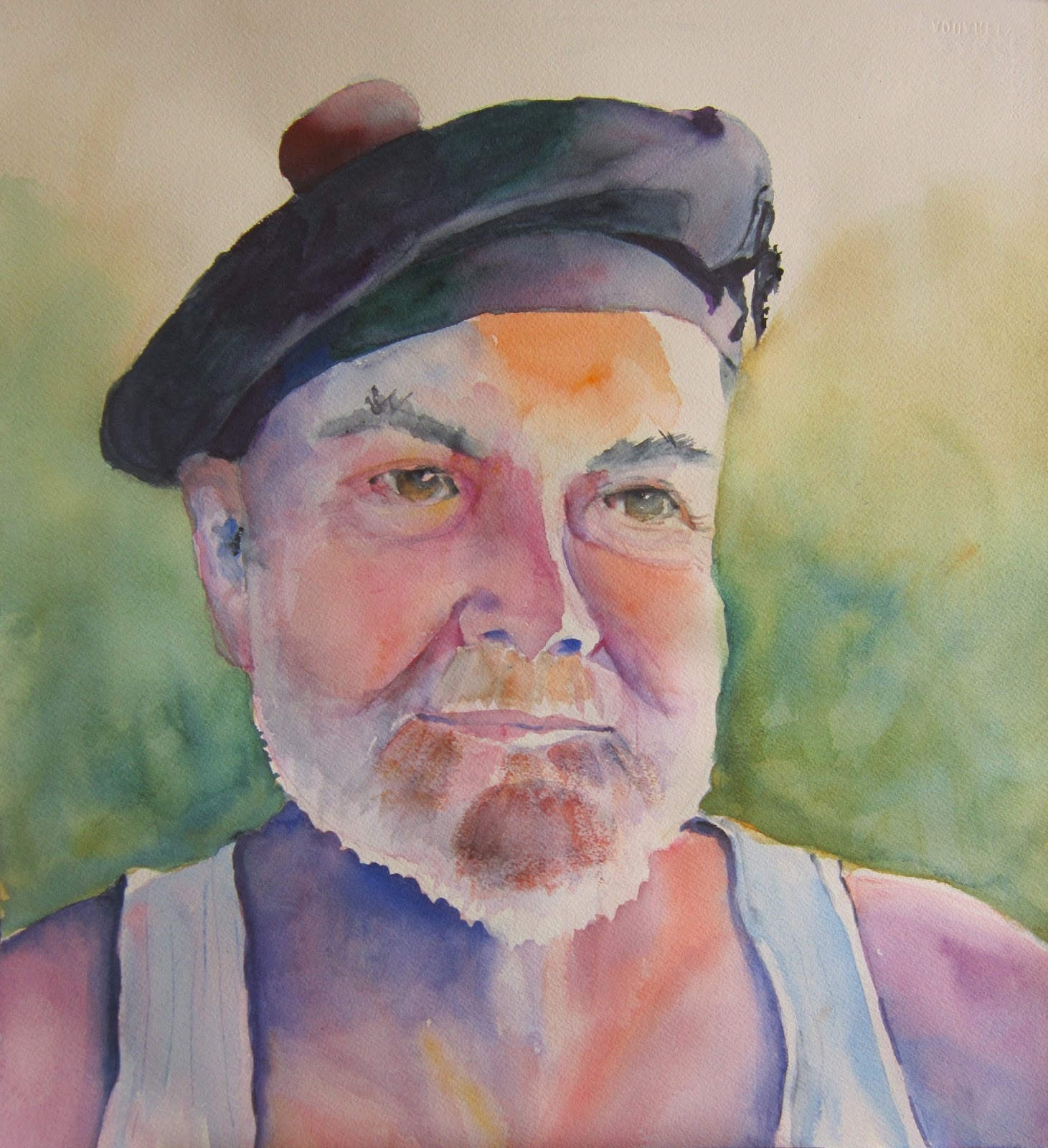
Just finished the portrait of Bob in his Balmoral hat that goes with his Anderson Clan kilt. Oh yes, I did leave the undershirt, which I am sure early in the morning Bob was not thinking would actually be in the portrait. Somehow the juxtaposition fits his fun personality.
 
 
My early morning photo of Bob
 
I cropped the photo and David Lobenberg, our instructor, really like the shot and the lighting. As we we were taught, I made a Paynes Grey study of the photo. I was rather pleased with the results. The only thing David had to do was help me recapture some of the white fringe of his beard. He did that with a white conte crayon, a wonderful suggestion that I will no doubt use in the future.


The study

Now it was time to tackle the painting in color. I failed to photograph the important stages, I was so into painting. First I did the "tea" stage, lightly carving out the features in very watery color. I used an orange mixed from Cad Yellow and Permanent Rose, the Rose, some Ultramarine Blue. and Alizarin Crimson, some straight, some mixed. Next I went in with thicker consistencies until I reached a point where I thought I was done. David suggested a light green/yellow as the background, the compliment of the reds. I was overly cautious and the result is a little washed out. Still I was thinking, not bad.

 
Almost done, though not really
 
I had set the painting on my easel and opened my eyes Saturday morning to go, heck no, I'm not so pleased. The colors looked washed out and I had homogenized some of it too much. I didn't have time to work on the piece, though. So finally, Sunday afternoon I hit the paints again. Let's darken that background and get a little more color into the hat. Though the pom pom is bright red, I felt that it would catch the eye too much. Better, but Bob has lot's of Scottish coloring in his complexion.
 
 
Better, but still not done
 
 I bravely went where I had feared to go. If you look at the final piece at the top of this post, you will see I added orange into his cheeks, color into his beard (his grey facial hair still has reds in the mustache and the chin areas). I defined the eye sockets near the nose with more crimson and blue, and put more blue on his right temple. I added those errant hairs to his thick eyebrows. I added a little roundness to his left check.

On Friday, David did a quick final demo and I watched the way he carefully puts down his strokes and does not always blend. He leaves lots of variations and some hard edges. I love his results. Check out his watercolor portraits.

I will save enhancements for my next shot at a portrait.


Friday, August 16, 2013

The No Color and Color Workshop

Payne's Grey Study # 2
8" x 6" watercolor
 
This week I am taking "No Color Water Color Portrait Painting - Taking Advantage of Paynes Gray," Sponsored by the Santa Clara Valley Watercolor Society (SCVWS).  David Lobenberg is an adjunct professor at Sacramento City College and a wonderful painter of expressive portraits. Here is David doing his demo on Sunday. For three and a half days, we worked just with Payne's Grey to learn value without the distraction of color. David uses unexpected vivid color and the paintings are very "loose" As I found out with Ted Nuttal, "loose" is not the result of flinging paint. David is very deliberate with his strokes and puts much thought into each one. I admire the way he moves the brush around in all directions to achieve variations in his marks.


David Lobenberg demo


A Lobenberg painting
 

Though David, a master at drawing, usually traces his subjects to save time, he wanted us to be able to draw and understand the underlying features of the human face.


When we did our studies, he had us use photos he supplied -- he uses students and friends as subjects. An important part of the process is understanding the consistency of your paint, which he likens to tea, milk, cream and butter. We would begin by creating the structure of the head with "tea." You are careful to leave the white of the paper and define the shadows. It's a little like Michelangelo's statement "I saw the angel in the marble and carved until I set him free." He stressed the importance of letting that layers dry, otherwise you end up with a mess.
 
 
Payne's Grey Study
Layer 1 done in "tea"
8" x11" watercolor
 
Next we went in and used the other consistencies of paint to finish the painting. Again, patience to let the paint layers dry is key.


Paynes Grey Study #1
8" x 6" watercolor
 
On the afternoon of Day 4 David had us do a Payne's Grey study of our own photographed subject.  You can, of course, guess that Bob is my subject. Here is the photo I am working from.


David says to photograph your subject outdoors in strong light, but Bob had to squint so much that I didn't like the photo. In the morning, I asked him to throw on a shirt and his Balmoral hat that goes with his kilt and posed him in next to our diningroom sliding doors. I didn't expect him to wear an undershirt, but found it rather charmingly quirky, so I am including it in my portrait. I have now done the tea stage, but I will save the studies and stages to show you when I complete the portrait.


Friday, August 2, 2013

Rengstorf House Art Exhibit


"City Girl" on display at the
Rengstorff House Art Exhibit

 
Rengstorff House
Part of the history of Santa Clara Valley
 
 
The Artist Reception for the Art Exhibit at Rengstorff House in Mountain View was very well attended. Several of my friends that paint with me on Thursday evenings were there sharing the fun. Several artists from Santa Clara Valley Watercolor Society also had work on display.