Thursday, November 11, 2010

Frank Webb Workshop: Day 5: The Calligraphic Mark

"Dining Italian Style"
11" x 14"
Watercolor
"Life above the Elevated"
11" x 14"
Watercolor

Calligraphic marks in watercolor was the painting approach of the day. I will probably use this approach rarely, but I have used it before on sketches. Here is Frank's demo. He first did wet-in-wet washes, leaving his white area alone. Of course the paint diffuses and mixes quickly, so he used a hair dryer to stop the flow and dry the paper for the next step. Using various flats and rounds he applied the calligraphic marks. He says it's important to leave open areas and not close off structures entirely. His finished painting is playful.

Frank Webb's harbor scene


I met with Frank and showed him the sketch I did from our room in Chicago looking down on a small section of the elevated train amidst the buildings in the area of the Loop. He liked the painting, made some suggestions on the design for varying the shapes and marks. I wasn't too happy with this painting. I felt I put in too many marks, and Frank suggested that fewer on the buildings would be better. He also noted that my design had more variation in the size of the buildings; my painting has buildings of similar widths.

I had about 40 minutes until until critique and I wasn't happy with my cityscape, so I grabbed a black and white printout of a street in Portovenere, Italy. Of course, after 5 days of learning how important design is, I skipped that step because painting is more fun, and besides everyone was going to see whatever I painted during critique. The upshot is I went oh oh, I almost forgot to preserve some whites and of course, the best place would have been on the awnings. Frank loved the calligraphic marks, but noted that my white "felony" could be reduced to the lesser degree of a misdemeanor by shading a bit of the right corner. Also, surrounding the right canopy with greenery (which it was in the photo) is bad design. I should have left a break in the greenery. Of course, nature doesn't make good designs, artists do.

I intend to make myself a little checklist for reviewing my designs -- variation and overlapping shapes are especially important for me to remember.

Also, I made notes of many art quotes that Frank gave us throughout the five days.
"Art is man-made order."
"We restore the disunity of nature to unity."
"Art is pleasure objectified." (George Santiano)
"We are shape improvers."
"Beauty is the quality that emerges from the deliberate relationship of the parts to the whole."

He shared much more wisdom with us that I didn't capture even though I am a prolific note-taker, as you can tell. I learn through writing, even if I never look at my notes again.

Frank again commented that this was the best organized workshop he has ever done. The Society has many years of workshop experience and those of us who worked on this one have inherited the wisdom and processes.

Wednesday, November 10, 2010

Frank Webb Workshop Days 3 and 4: Painting Patches and Drizzling Paint

"Memories of Ghost Ranch"
Watercolor
15" x 22"

Frank Webb's demo: Mixing Color on the paper
Sugar House
Arlington, VT

Frank has demoed a unique approach to watercolor each day. Let's start with Day 4, as I felt more successful. Frank calls this drizzling paint on the paper. He told us to bring a table easel or he would show us how to use a folding chair. I like an easel and have had one at the workshop all week. We would be placing our paper at a 60 to 70 degree angle. I usually work on an angle, usually about 45 degrees.

Frank first laid the board flat and put on a cool blue wash, making sure it was plenty wet and painting around his whites. Then he placed the board on the easel and brushed on other colors. At this point he dried the underpainting so he could continue. From there he worked on various sections, mixing the colors on his paper, not on the pallete. I could especially relate to this painting as I grew up in Vermont and I'm familiar with Arlington, the long-time home of Norman Rockwell who painted his neighbors.

I am still feeling inspired by my visit to New Mexico in the past few weeks, so I referenced several photos and created a design. The cliffs are reminiscent of Ghost Ranch and Georgia O'Keefe, as is the dead Pinon tree in the foreground. I totally made up the pueblo-style home, and made vegetation in keeping with that desert area. I then met with Frank to review my 4" x 6" sketch with value patterns. He made a few suggestions in which I enlarged the house to get better overlap with the trees. I had envisioned the cliffs at a distance from the house, but Frank said cliffs rising right behind the building would be much more effective. I am so impressed how each day he meets personally with each of us to discuss our design.

Frank emphasizes saving our whites, but I felt the cliff was too large a blank to leave totally white, so I modeled it in very light washes to suggest white. I worried that Frank might say I had committed a venial sin, but he totally liked this painting and deemed it very successful. He noted my whites in the cliff and the left side of the house. I felt like I had gotten an A for the day.


'Taos Pueblo, New Mexico"
15" x 22"
Watercolor

Frank Webb's demo painting: Patches of color
Spanish church south of Phoenix, AZ


The demo on Day 3 emphasized painting patches of color. Frank said this is a real good exercise for learning to keep the values the same using multiple colors. He talked about warm and cool colors as he did his demo. What strikes me about his painting is how fresh and painterly it appears. The key is to lay the colors down and gently blend them by touching the edge of the previous color.

I decided to work up a design using photos I took in 2008 while visiting the Taos Pueblo, one of the most intact pueblos in the US. However, I had none in the configuration or the orientation I wanted. The wall is an entry to the Catholic Church in the pueblo, and I wanted it in the foregrounds. So I managed to draw pueblo buildings and the wall at angles so I could play up the light and shadow areas.

Frank did not mention any errors, but I know that I did not achieve the same degree of freshness as he did because I put my brush back into some of the patches. Paint to water ratio is key to success. I like the composition and want to try it in a Day 4 or a Day 1 (layers with mother color) technique. Perhaps I'll even do patches again. Patches was an excellent exercise on values.

Tuesday, November 9, 2010

Frank Webb Workshop Day 2: Painting Wet-Into-Wet

Frank Webb demos Wet-into-Wet technique"

I'm a day behind in describing the workshop. I just came from a lovely dinner with Frank and some of the workshop participants. We take the instructor out one night and attendees are welcome to join us for a no host dinner. We had a very nice visit.

Frank's Day 2 demo was Wet-into-Wet. I had hoped to do a Southwestern scene, but I felt that a wet technique lent itself to foliage, so I again did sunflowers and a French farm in the Dordogne. The photo is cutting off a bit of the left side. When we met to review my design, Frank a suggested a change to the mountain for a more effective sky shape. I had a second mountain on the left. At critique, Frank noted that the the three cypress trees were of similar size and intervals, a no no. I know that -- when will this consideration become automatic? He also would prefer more overlap of the two buildings. The rest of the painting passed muster. Frank does a great job emphasizing design principles.

Frank has an interesting perspective on making a living with art. He doesn't believe that it is realistic for most people; of course, there are exceptions. He says most full-time artists either are wealthy or have a spouse who provides some support. Frank attended art school on the GI bill and started his own advertising design company. He worked with many major companies, especially the steel industry in the Pittsburg area where he lives. In the 70s, he attended 10 summer sessions with Ed Whitney in Maine. After 30 years, in the 1980s, he gave his company to his employees and focused on his art. Read his biography of art accomplishments here. Frank is a warm, humorous, and very well-spoken instructor. It's obvious that he loves to teach. Now in his 80s, he still teaches about 17 workshops a year. Frank's story is similar to that of other well-known artists who teach. Mel Stabin was in advertising design in NYC. Tony Couch flew commercial aircraft for a major airline. (He told us about describing his vacation with Ed Whitney doing art to his fellow pilots. They looked at him like he was from Mars.) Gerald Brommer taught high school and wrote a lot books.

Tomorrow I will recap both Day 3 and Day 4.

Sunday, November 7, 2010

Frank Webb Workshop Day 1: Using a Mother Color


"Sunflowers in the Dordogne"
15 x 22
Watercolor

Frank Webb discusses design
(His painting is visible in the overhead mirror)

One of the best things about being a volunteer on the workshop committee of Santa Clara Valley Watercolor Society is meeting some of the best and most well known watermedia artists. When I first started doing watercolors in the 90s, I was especially taken by the artists who had studied with Ed Whitney. I took books out of the library and especially enjoyed one by Frank Webb.

Yesterday I hosted the open demo, free to anyone who wishes to attend. You need not be a member of the society. Frank proved to be charming, witty, and very clear in conveying his thoughts on design. The airlines had mis-tagged his luggage containing paints and other supplies, and sent them to a remote Texas town, so we were into improvising. I provided a board and full sheet of Arches paper. What to do about a palette? Frank likes one without a barrier between the well and the mixing area and I had the more common design. I suggested my turkey platter and that's what he chose to use from several options I presented. I brought my paints and took him to the art store before the demo to buy a tube of Quinacidone Gold. We all had a good chuckle when I explained the unusual palette to demo attendees. His supplies were waiting at the hotel when he returned after the demo.

Today we began a 5-day workshop and I was very busy opening the facility at 8, getting hospitality food and coffee ready, and starting the workshop on time. I was flattered when Frank said that we were the most efficient and organized leaders he had had. I suppose he says that to "all the girls (or boys)," but it warmed my heart. Those 30 years of IBM project management pays off, and I have equally skilled managers working with me.

Here is the workshop synopsis in Frank's own words, "The single, most important focus will be pictorial design, which includes planning, color, tonal values, expression and visual theme." Frank told us he would demonstrate different approaches to creating a successful painting. Today he used a very wet wash to lay down a "Mother Color" (Quinacridone Gold) over all of the paper except where he wanted to preserve the white. This painting focused on shapes, and did not have a great deal of modeling. Frank is not interested in exact reproduction, but rather in creating a pleasing design. He built the structure in layers. Putting in the darkest darks and some calligraphy last.

Frank first gave a demo, all the while discussing overlapping shapes, variation, harmony, repetition and most of all value. He says you can use any color, but the values must read correctly. Frank always works from small sketches he's done on location or from memory using a 6B graphite pencil. He divides the picture in 4 values - white, plus light, medium, and dark. The mid-tone values are what holds the pictures together, so there will be more of them. He grids his sketch and his support, then he does freehand drawing from the sketch. While painting, he frequently refers to the sketch for value choices.

The rest of the day, we designed and painted. During the final hour, we had critique. Frank has a wonderful approach to providing individual instruction. He has people sign up to review their designs with him. I chose to paint a farm in the south of France amidst sunflower fields. My references were a painting done while on an art vacation and two photos. He liked the design, but made a few suggestions, including adding the vertical tree in front of the smaller building and a path into the farm area. He liked where I was saving whites and suggested I do the same along the top of the sunflowers. Along the way, I failed to keep the whites of the sunflower tops, duly noted in the critique. Frank says to leave mostly white and introduce touches of yellow to suggest the flowers. The other criticism was the shape of my mountain. Rarely do mountains have a concave section like I drew on the left, they are usually convex. Mental notes to self on both items. Frank was quite complimentary as a whole on this painting.

I felt that I was working so hard to use non-standard color and correct value that I lost the sense of place. This scene conjures up memories of lots of yellow, bright sunshine, hazy hills, and lovely French architecture. I believe it's a fairly strong painting, but it's not true to my memories. Perhaps I will redo it sometime in higher key colors and I will keep that white along the tops of the sunflowers.

I also reviewed with him a small watercolor sketch done from our room on the Sognefjord in Norway. The link takes you to it. Frank really liked the painting and made a few small suggestions to strengthen the design. I want to do this one during the workshop on a half sheet.

The third painting we discussed was one I did in Tuscany on an art vacation.
"Mazzola, Italy"
11 x 14
Watercolor

Frank liked this painting just as it is, so I will repaint only if I decide to do it on a larger sheet of paper.

Tomorrow I hope to do a Southwestern scene recalling our visit to New Mexico.

Friday, November 5, 2010

Frank Webb Workshop and a Report on the Post-Impressionist Show

"Birthday Gourds"
In progress
Watercolor


Will the real birthday gourds please stand up?

As I sign off for a bit to coordinate a demo tomorrow and a 5-day workshop featuring Frank Webb, I leave you with a work in progress. Bob's daughter Jamie gave him a wonderful and unusual cut bouquet for his birthday in October. The fruit looks like little pumpkins, most in a bright red-orange, but some still in their lime green phase. These colors are Jamie's favorites and were featured in her beautiful wedding last year, so the gift is extra special. We were tickled pink (as they say in New England) so I photographed them on the dining table. Before leaving for Santa Fe, I took one branch to my Thursday night art group and drew a composition free-hand on my watercolor paper. Last night I hosted the Thursday night bunch and began the painting.

Now I will set the painting aside until after the workshop. I've been busy coordinating with the artist, helpers, and attendees; shopping for hospitality food; making badges; and arranging accommodations.

Let me take a few minutes to recap the Post-Impressionist show from the Musee d'Orsay on loan to the de Young Museum in the city. My drawing class took a field trip the day before we left for New Mexico. We had a wonderful time viewing pieces by Van Gogh, Degas, Cezanne, Gaugain, and beyond. Let me say that "Starry Night" looked just as vibrant as when I saw it in Paris. After feasting on the masters, we enjoyed the semi-outdoor seating at the museum cafe. Here is a picture of instructor Bob Semans fittingly seated beneath a Van Gogh self-portrait.
Robert Semans
Artist

Bob is a wonderful drawing instructor and has made his living doing commissioned portraits for many years.

Here is the view from the top of the de Young:


View from the top of the de Young Museum
toward Golden Gate Bridge

We had a wonderful day shared with fellow artists and some spouses.

I'm sure I will have much to report about Frank Webb, a watercolorist who has had a fabulous career.

Monday, November 1, 2010

Georgia O'Keefe's Mountain

"Georgia O'Keefe's Mountain"
The Perdenal
Ghost Ranch, NM

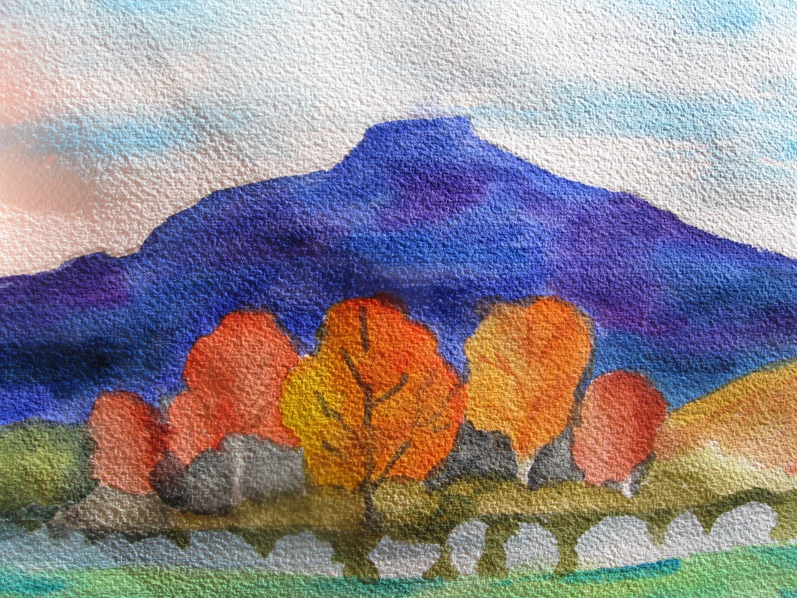
Georgia O'Keeefe said God told her she could have this mountain if she painted it enough times. Friday we drove north to Abiquiu and on to Ghost Ranch. There we took the O'Keefe Landscape Tour on a clear sunny day. We stopped at a number of places that inspired her work. We passed her summer home on the ranch where the view from her front yard was of the Perdenal. As we drove away from the ranch, I took a photo of the Perdenal fronted by beautiful fall colors.

I ended up with a shape painting with my simple Koi set and water brush. The grey shapes represent the sage. There were layers of color with the pale green grass in the front. The mountain looked almost black in the distance.

This morning we visited the O'Keefe Museum which had a lovely display of her landscape, bones, and abstract paintings, some inspired by the places we toured. We attended a continental breakfast and gallery talk by the chair of the Art Department at the Santa Fe University of Art and Design.

Friday, October 29, 2010

Driving the RioGrande in New Mexico

"Driving the Rio Grande"
South of Taos, NM
Bob's Photo from the Car

Yesterday we did the Taos loop from Sante Fe. On the way to Taos, we traveled on the High Road through snow-capped mountains and the colorful trees. I will likely paint at least one of those scenes later. We stopped at a great, funky little cafe in an old theater, Sugar Nymphs Bistro, and they delivered on their promise -- fresh pies, cobbler, and cookies arrived on top of the counter while we dined on very fine Southwestern cuisine. Bob could not resist the chocolate, maple pecan pie with ice cream. I had to have a couple bites and it was yummy.

We drove the River Road along the Rio Grande where we were treated to brilliant fall colors against muted grey sages and sparse flora on rugged mountains. This morning between breakfast and a Georgia O,Keefe landscape tour, I referenced Bob,s photo taken from the car at a dirt pullout to paint this scene using my tiny Koi pan paints and water brush.

Monday, October 25, 2010

Monday Pomegranate and Plums

"Pomegranate and Plums"
Pastel
13" x 16"

We did a still life today using fresh fruit and a pretty, small white porcelain bowl. Bob set the table in the middle of us to have more room, but that meant that the setup was less than ideal. The plum was right next to the bowl so I artistically moved it over in my drawing. I eliminated the second pomegranate that just stuck up behind the bowl. Bob stated midway through that he now realized the bowl was rather small for the size of the pomegranate. I struggled with getting the right color and value for the background. As always, this is partially done as there just isn't time to do a completed piece on a Monday morning.

Tomorrow our group is going on a field trip to the De Young Museum in San Francisco to see "Van Gogh, Gauguin, Cezanne, and Beyond, Post-Impressionist Masterpieces from the Musee D'Orsay." This is very exciting. We saw the Pre-Impressionist Masterpieces, which included Whistler's Mother among the famous works of arts loaned during a remodel of the D'Orsay. That trip was in early June. Our wonderful artist, Bob Semans, gave us commentary about the works. We get to bring guests if we like, so my Bob is going with us this time.

Then we install the house sitter and visit Santa Fe and Georgia O'Keefe country for 6 days.

Wednesday, October 20, 2010

Playful Poppies and an Art Show Report

"Dancing Poppies"
11" x 14"
Watercolor and Collage
***See addendum***

This past week I decided to experiment with my favorite California wild flowers, Poppies. However, I was not happy with the intermediate stage and got bogged down. So I thought about Gerald Brommer and collage and decided to cut out some of the Poppies and tear up parts of the half-done background. I arranged the pieces on 300 lb. Arches watercolor paper until I found a harmonious arrangement. I used gel mat medium to glue the pieces to the backing. I need to let this one simmer a while to decide if I want to do any more to this piece.

The Santa Clara Valley Watercolor Society Members Show hosted the reception at Rose Shenson Gallery at the Triton Museum in Santa Clara on Sunday. As we left church that day, the skies opened up with the first real rain of the season. I don't believe we've had rain since May. The reception is always outside the gallery, so I wondered how Janice Faulstich and her helpers would pull this one off. They did so beautifully and we had a huge crowd attending. They used portable covers over the deck of the gallery where the food was layed out and over the rows of seats set up for the awards ceremony. I really could not get a good look at the show with so many people and must return. Award winners included friends Myrna Wacknov (second place) and Jeanne de Campos-Rousseau (sponsors award). Jeanne is my fellow exhibitor in Santa Cruz. At the moment our SCVWS website has not yet posted the winners.

An invitation via Facebook resulted in a fortuitous intersection between my bicycle riding life and my art life. One of the women in my bike club replied that she would be leading a ride in the area and they would stop by. Sure enough, when I arrived a bit after the start of the reception, there were my cycling guests with mud trailing up the back of their day-glo green jackets. These hardy souls rode in the rain and made good on Joanne's promise. They enjoyed the art, used the facilities, skipped the buffet line, and went on their way. They made my day!

Addendum: Originally I titled this work "Playful Poppies," but Kathy Cartwright, a superb artist, said they were dancing. I loved the description so much, I've retitled the work. Check out Kathy's wonderful blog and her website.

Monday, October 18, 2010

Drapery Folds Modelled in Pastel and Jamie's Art

"Drapery"
11" x 14"
Pastel

Bob Semans originally planned to demo modelling a crumpled paper bag. Not sure if he took pity on us or just preferred to do draped linen, but that's what he did. He set up the drapery over a table edge under warm light. The most difficult places to model are parts of the folds is in the half light. Getting the piece to read correctly so there is perception of roundness is a bit of a trick. We combined a warm, 0ff-white pastel with charcoal. We had about an hour and half to work on our piece after Bob's demo. I enjoyed the challenge and need to develop my skills further. I had to look closely for small variations in light and shadow. I was referencing a nice value scale that Bob made up for us. As always, I could spend many more hours completing this piece.

Mondays are pleasant. After 30 years of Mondays in high tech, I savor my drawing class. I combined bicycle and light rail to cover the 32-mile round trip. I stopped at MacDonalds for a senior coffee, and went to lunch after class with Bob and several other students at Race Street Fish and Poultry where I enjoyed the Ahi Tuna. Light rail and a downtown MacDonalds keeps me anchored in the realities of life with people from many cultures and socio-economic backgrounds. It's good to be reminded that even my diverse neighborhood is not representative of the realities of the USA and San Jose in 2010 with a faltering economy.

On a wonderful lighter note, I came across a partially done collage by my granddaughter, Jamie, 16, while visiting my son's family in Vermont. Her mom explained that when they were getting their dog, Bailey, from the pound, Jamie was lobbying for a border collie, which sweet mutt Bailey is not. So one night she sat down with paper and scissors and began this piece. I just love how creative she is. When she finds out I snapped a picture of this piece, she will say, "oh, that! I was just having fun." Jamie's teacher is taking her and her portfolio to Boston for a review done by representatives from the top USA creative art schools.


"Border Collie"
Partially complete collage
by
Granddaughter Jamie

Thursday, October 14, 2010

Delayed Monday Morning Drawing Class Report

"Peach and Plums"
11 x 14"
Pastel

With hanging shows and then needing to catch my breath, I did not post my Monday morning class drawing. I like the results of my work on the fruit. The plum on the right was a rich deep color and the one on the left was a bit more reddish and translucent. I like the dark core shadow on the peach. The cloth, though, doesn't suit me, at least not yet. It was a white linen cloth and instructor Bob Semans created lots of folds. Part of it drapes over the edge of the table into shadow. We all struggled with rendering folds, so next week Bob will bring a paper bag that he will crumple, and he will demo his approach.

Tuesday, October 12, 2010

Shows are Hung

Les Trois Artists
Vino Prima Wine Bar
Santa Cruz Wharf
October 11 through December 5
Reception November 20, 2 - 6 p.m.

Yesterday after Monday morning drawing class, Bob and I drove to Santa Cruz to hang the show on the Santa Cruz Wharf. There are three artists showing: Jeanne de Campos-Rousseau, Diana Henrichsen, and I. One small wall bears the title of the show and one painting each. Mine is "Big Night Out" on the upper right.

Because the area has many windows and we were experiencing a picture perfect warm fall day on the coast, the paintings under glass have a lot of reflections in these photos. Diana is showing "Watercolors of California, en Plein Air," a very lovely collection of her works showcasing the beauty of the area in which we live.

Diana Henrichsen

Jeanne's work honors "First People of America."


My work celebrates "Moments in Time" with works featuring people, landscapes, and still lifes.


On Saturday, I worked the take in duties at the Santa Clara Valley Watercolor Society members' show. I saw some absolutely wonderful art coming in, so it's a show well worth seeing.

It felt funny this afternoon to slow down for a moment after working very hard to prepare for the shows, along with many other commitments since we returned from back East. Now, I need to get organized and refocused.


Wednesday, October 6, 2010

SCVWS Members Show

"Memories of Norway
13" x 18"
Watercolor

Santa Clara Valley Watercolor Society has a Members Show each Fall. There is no juried process to get in, though there is a juror for cash and sponsor awards. I had to file my entry form before I left for the East Coast, so I finally decided to enter my fantasy Norway piece for Alternate Realities." I had created a quarter sheet painting shown and discussed in this post. I knew it was successful when my critique group found nothing to suggest for improvements and really liked the piece. They are a very honest and helpful group of artists that I meet with once a month. However, I wanted a slightly larger piece for the show. In the process I changed the design a bit, and I am happy with this second iteration. As always, I am not great at photographing my work, so this looks a bit askew and it is really straight and true.

The earlier post has the explanation about the inspiration and process, so you might like to read that. Basically I loved the photos I took in the Viking Museum on Bydoy Island in Oslo, Norway in June. I also did a happy painting of the Sognefjord where we stayed in the tiny town of Balestrand. I used the fjord as a backdrop to the ship sailing. The Oseberg ship was a burial ship built in 800 AD. The carvings that embellish this painting were on a wagon found inside the ship. I love the animal symbols and the use of incised line. The Norse people were, and remain, great ship buildings, carvers, and sailors.

This painting is done with a complementary scheme of three colors -- Cerulean Blue, Ultramarine Blue and a Yellow Orange -- and a bit of Ultramarine Violet. I spent two days on design work and then began painting the frame first. It was night and my light source was poor, so in the morning I realized I had not replicated the deepest color. I then experimented and found that with my Quiller palette, I had taken advantage of the exact complements to grey out the Ultramarine Blue with a touch of the yellow orange. Yesterday I painted over the background again and I like the opaque quality I achieved. It sets off the Cerulean Blue and Yellow Orange pure hues.

In this painting I softened and diffused the background and really emphasized the Viking ship. I took the advice of a very successful local artist, Terri Hill, who wrote about using opposites for emphasis, such as hard against soft. Terri is a member of the society, as is Myrna Wacknov and Mike Bailey, and many other fine artists with great reputations, so I am a small fish in a big pond, and feel very lucky to learn from these artists and associate with them. It was Mike who helped me see that some of my strength comes from the family engineering gene and I like the shape and line elements.

I hope if you live in the area you will take advantage of the opportunity to see a collection of very nice work. The show is in the Rose Shenson Gallery on the grounds of the Triton Museum in Santa Clara. We will have a reception and all are invited.

Rose Shenson Gallery
Triton Museum
1505 Warburton, Avenue
Santa Clara, CA

Visit the show:
October 16 - November 13
Tuesday - Sunday, 11 - 5

Come to the reception:
Sunday, October 17
1 to 4 pm.


Tuesday, October 5, 2010

Monday Pastel and Joan's Chili Peppers from the Coast

"Copper Bowl with Gourds"
Partially completed pastel
20" x 14"

"Coastal Chili Peppers"
Rockport, MA
by Joan Kendall
Oil


I returned to Monday morning drawing class with instructor Bob Semans. I just love this class. I've done this copper bowl before, it's old and tarnished and the black shows up beautifully in the shadow when Bob puts a spotlight on the still life. The gourds provide a nice contrast and say "Fall" on the first day that we've had really cool fall weather. The challenge here is drawing the ellipsis shape of the bowl as it's tilted away and slightly sideways. Bob has us start by drawing two lines from the widest points that cross at a 90 degree angle at the center. In this case the vertical line was slanted about 30 degrees. Because the bowl is tilted the ellipsis is wider than it is long Very challenging.

The other challenge is to get the values correct. Bob always says that if your painting does not look right, it's almost always a drawing problem, and often its incorrect values. I was too timid at the start and Bob came over and really ground the charcoal into the right shadow. The final challenge for me, especially in a realistic pastel, is to separate value and color and select a stick that has strong enough chroma. Bob had to guide me a bit on the gourd in the bowl where I did not have enough yellow-gold. A great morning spent among like-minded artist friends. As I am painting for two shows right now, it may take me while to get back to this pastel. I was delighted to learn that one of my classmates sold one of her still life pastels through a shop in Los Gatos, a very tony nearby town. She said it was one of the colander and onions, which I also did here.

The second painting was done in oils by my friend Joan Kendall as a result of our wonderful week's art vacation at "the barn" (a family cottage) on the North Shore of Boston at Rockport. In an earlier post I showed the front of the cottage in a watercolor sketch. The window boxes were nicely planted by the landscape architect owner of the cottage. We were delighted to find hot little chili peppers tucked in among the flowers. Joan's son came from RI for a day with us and took a closeup photo of them. We marveled at their colorful, waxy beauty. Joan has done such a beautiful job of capturing these lovely agricultural gems.

Friday, October 1, 2010

More art from the North Shore of Boston

"Rockport Headlands"
14" x 11"
watercolor

"Sunrise on the Headlands"
Rockport, MA
Oil
by Joan Kendall


On a very windy, sunny September morning in Rockport, MA, my artist friend Joan Kendall and I walked down our small Cove Hill Lane and clambered over the rocky headland to find a sheltered place to paint. We huddled behind a large rock looking down on the impressive headlands. I had just had time to sketch the rocks onto my watercolor block when the wind shifted and we were too uncomfortable to continue. Later in the day, we painted indoors at "the barn" (our rental cottage's loving family name). I used granulating paints -- ultramarine blue, burnt sienna, and raw sienna, with some diazanon purple and alizarin crimson thrown in for variation -- to achieve the light patterns on the rocks. Last night with my Thursday night Southside Art Club, I added the roiling water. I'm going to study this one a few more days and may add more color into the water.

Our final evening in Rockport, we walked again on the headlands and watched a beautiful sunset. Both Joan and I took many pictures for future reference. Joan's oil painting is a combination of memory of past sunrises, artistic license, and love of the sea. She captured that moment early in the day when the rocks are very dark, the sky has a faint smudge of red-orange, and the water is a mixture of opaque and translucent passages. I just love this little piece.