"The Scotsman"
15" x 16.5" Watercolor
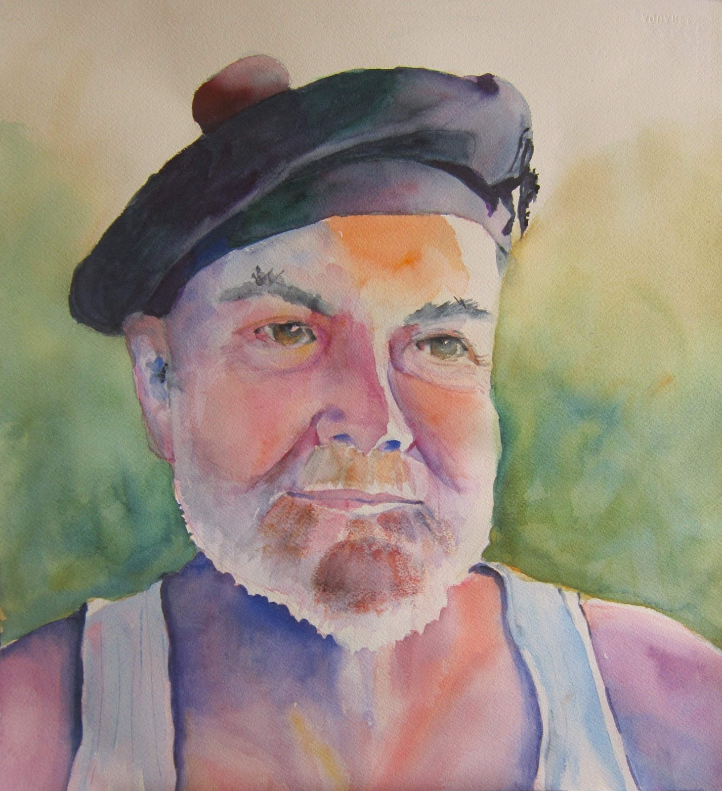
Just finished the portrait of Bob in his Balmoral hat that goes with his Anderson Clan kilt. Oh yes, I did leave the undershirt, which I am sure early in the morning Bob was not thinking would actually be in the portrait. Somehow the juxtaposition fits his fun personality.

My early morning photo of Bob
I cropped the photo and David Lobenberg, our instructor, really like the shot and the lighting. As we we were taught, I made a Paynes Grey study of the photo. I was rather pleased with the results. The only thing David had to do was help me recapture some of the white fringe of his beard. He did that with a white conte crayon, a wonderful suggestion that I will no doubt use in the future.

The study
Now it was time to tackle the painting in color. I failed to photograph the important stages, I was so into painting. First I did the "tea" stage, lightly carving out the features in very watery color. I used an orange mixed from Cad Yellow and Permanent Rose, the Rose, some Ultramarine Blue. and Alizarin Crimson, some straight, some mixed. Next I went in with thicker consistencies until I reached a point where I thought I was done. David suggested a light green/yellow as the background, the compliment of the reds. I was overly cautious and the result is a little washed out. Still I was thinking, not bad.

Almost done, though not really
I had set the painting on my easel and opened my eyes Saturday morning to go, heck no, I'm not so pleased. The colors looked washed out and I had homogenized some of it too much. I didn't have time to work on the piece, though. So finally, Sunday afternoon I hit the paints again. Let's darken that background and get a little more color into the hat. Though the pom pom is bright red, I felt that it would catch the eye too much. Better, but Bob has lot's of Scottish coloring in his complexion.

Better, but still not done
On Friday, David did a quick final demo and I watched the way he carefully puts down his strokes and does not always blend. He leaves lots of variations and some hard edges. I love his results. Check out his watercolor portraits.
I will save enhancements for my next shot at a portrait.


5 comments:
Mary, this is a wonderful portrait, and I love the undershirt. I can see Lobenberg's influence--I've always loved his colorful portraits. This is one of your best.
Absolutely fabulous work, Mary! Bob must be so proud!
A beautiful portrait, Mary!! I love all the colors you put in his face!!
FANTASTIC work!!!
Really nice portrait Mary! I loved seeing your process, too. I enjoyed seeing Lobenberg's website. Thanks for sharing :)
Well done, Mary! I bet Bob loves it!
Post a Comment